Case Study – Kashier App UX Optimizing the POS Experience
Kashier App UX Case Study – Optimizing the POS Experience
Kashier is a leading fintech company in Egypt providing digital payment solutions for small and medium merchants.
The company aimed to enhance its Point of Sale (POS) application, ensuring a frictionless payment experience across mobile and tablet devices.
While the existing app supported electronic payments, merchants faced difficulties during high-volume transactions and onboarding new staff.
The challenge was to rethink the user experience — making the POS app faster, clearer, and easier to use, while maintaining trust and reliability in financial transactions.

The Challenge
Kashier needed a deep UX analysis for its POS app to:
- Integrate seamless e-payment methods (QR, card, invoice, and cash).
- Simplify user journeys for non-technical merchants.
- Ensure scalability and visual consistency across mobile and tablet devices.
Existing pain points included:
- Complex multi-step transaction flows.
- Redundant input fields and navigation loops.
- Limited adaptability to different devices.
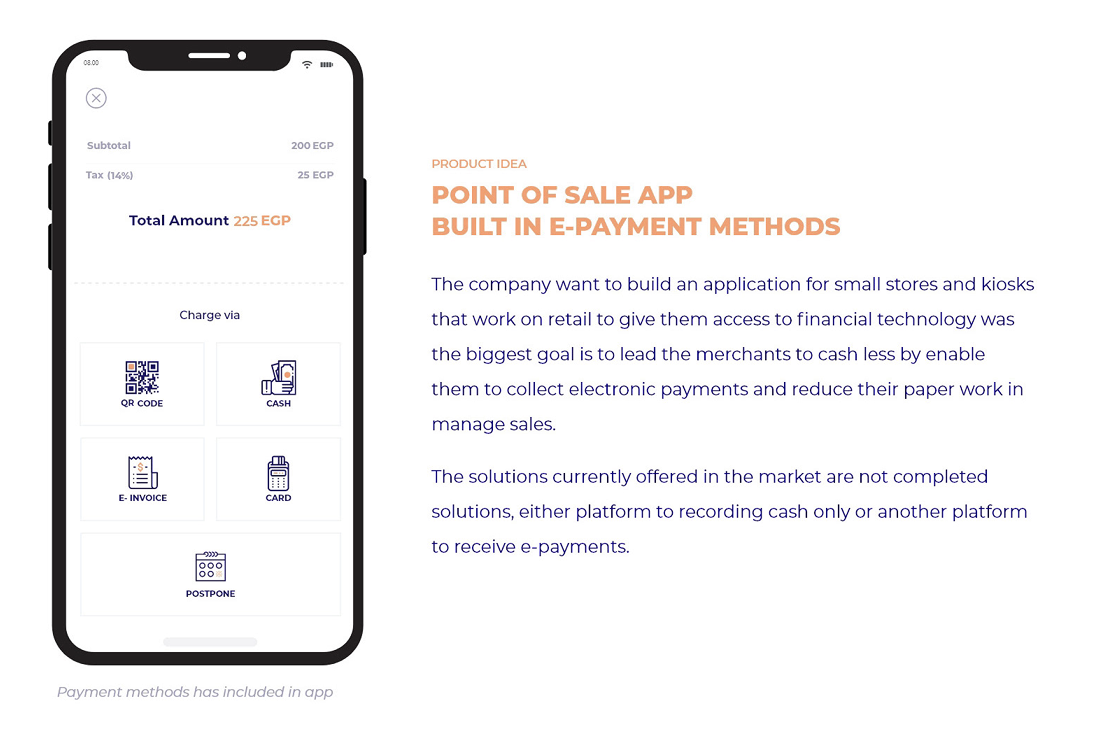
💡 Solution Overview
We conducted a comprehensive UX research and redesign project, focusing on:
- Activity Roadmap – structured phases from discovery to implementation.
- Existing Solution Analysis – benchmarking leading POS systems like Shopify, Square, and Vend.
- User Research – creating personas and empathy maps representing merchants’ needs.
- Prototyping & Testing – iterative validation across mobile and tablet environments.
My Role
As Senior Product Designer, I collaborated closely with:
- Product Managers
- Engineers
- Data Analysts
- Merchant Experience Team
Responsibilities
- Led the UX audit and identified key friction points.
- Designed interaction flows and prototypes.
- Conducted usability testing and synthesized findings.
- Defined a scalable design framework for future iterations.
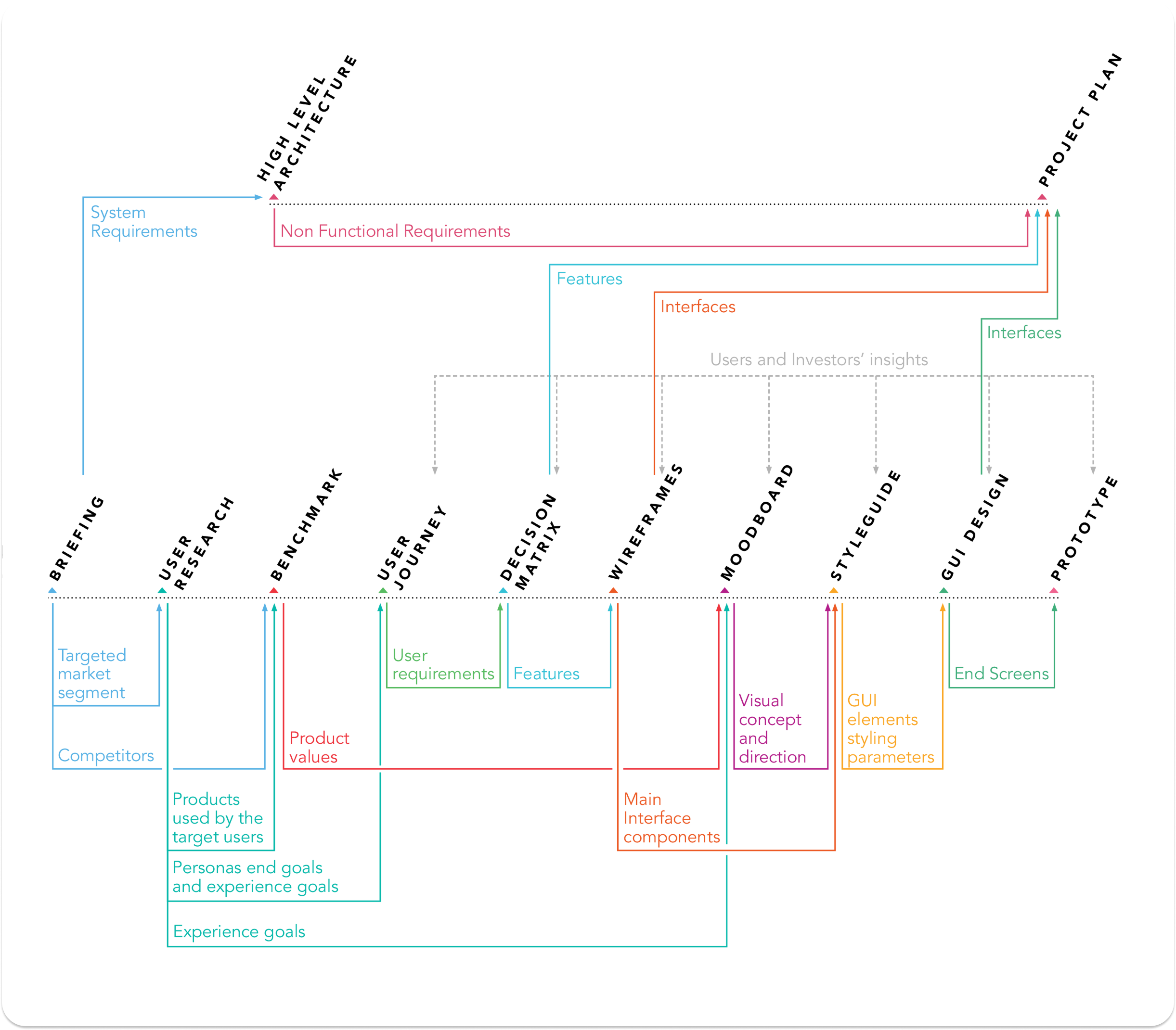
Activity Roadmap

🔍 Research Insights
Quantitative & Qualitative Findings
- 60% of merchants struggled with multi-method payment flows.
- 65% needed a simpler “end transaction” confirmation.
- 82% wanted to reconcile multiple payments faster.
“I just want to charge the customer and print the receipt — not go through five screens.”
— Merchant Interview, Cairo
These insights guided the redesign toward speed, clarity, and trust.
Personas
We developed four user personas representing different business scales and tech literacy levels:

To better understand our user base and design solutions tailored to real business workflows, we developed four key user personas that represent varying levels of business scale, mobility, and tech literacy. Each persona helped guide our design decisions — from interface structure to task prioritization.
1. Retail Owner
A small to mid-scale business owner managing one or multiple branches.
Key Needs: Fast checkout process, clear sales tracking, and consolidated reporting across all stores.
Pain Points: Manual reconciliation, delayed transaction insights, and lack of unified sales visibility.
2. Kiosk Seller
Operates compact POS setups in high-traffic areas like malls or markets.
Key Needs: Quick, reliable, and simple cashless payment flow that minimizes steps per transaction.
Pain Points: Complex interfaces, poor connectivity handling, and inconsistent payment confirmations.
3. Franchise Manager
Oversees multiple teams and stores with distributed management.
Key Needs: Multi-user access, performance analytics, and real-time synchronization between branches.
Pain Points: Limited control across stores, difficulty comparing branch metrics, and user role confusion.
4. Mobile Vendor
Runs an on-the-go business using handheld POS systems.
Key Needs: Fast, one-handed operation, optimized for limited attention and small screens.
Pain Points: Cluttered interfaces, small input fields, and long transaction completion times.
Each persona directly influenced feature prioritization — Retail Owners drove reporting improvements, Kiosk Sellers inspired simplified checkout flows, Franchise Managers validated the need for hierarchical access control, and Mobile Vendors shaped responsive design for tablet and handheld usability.
Empathy Map

Think & FeelSeeSay & DoHear“It’s complicated — I’ll just use cash.”Competing apps with unclear UI“I need faster confirmation.”“The app should just work.”Worries about losing dataTransaction listsTracks manually in notesHears that digital is unreliable
Pain Points: Complexity, lack of transparency, repetitive data entry.
Opportunities: Simplify inputs, highlight confirmation, unify transactions.
Design Process
We followed an iterative Design Thinking approach, focusing on measurable outcomes:
- Define the problem (merchant drop-offs and slow transaction flow).
- Ideate low-friction alternatives to form entry and payment processing.
- Prototype and validate across multiple environments.
- Refine based on metrics and qualitative feedback.
Each iteration improved task success rates and time-to-complete metrics significantly.
wireframe

Flows
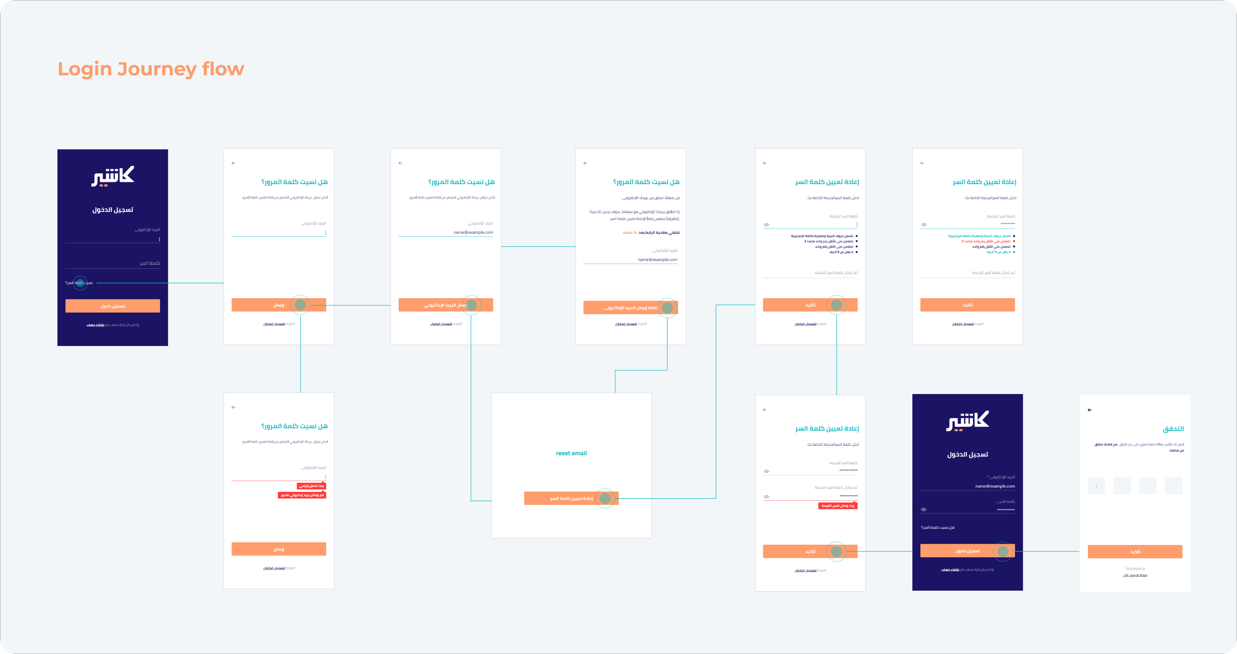
1- login journey flow
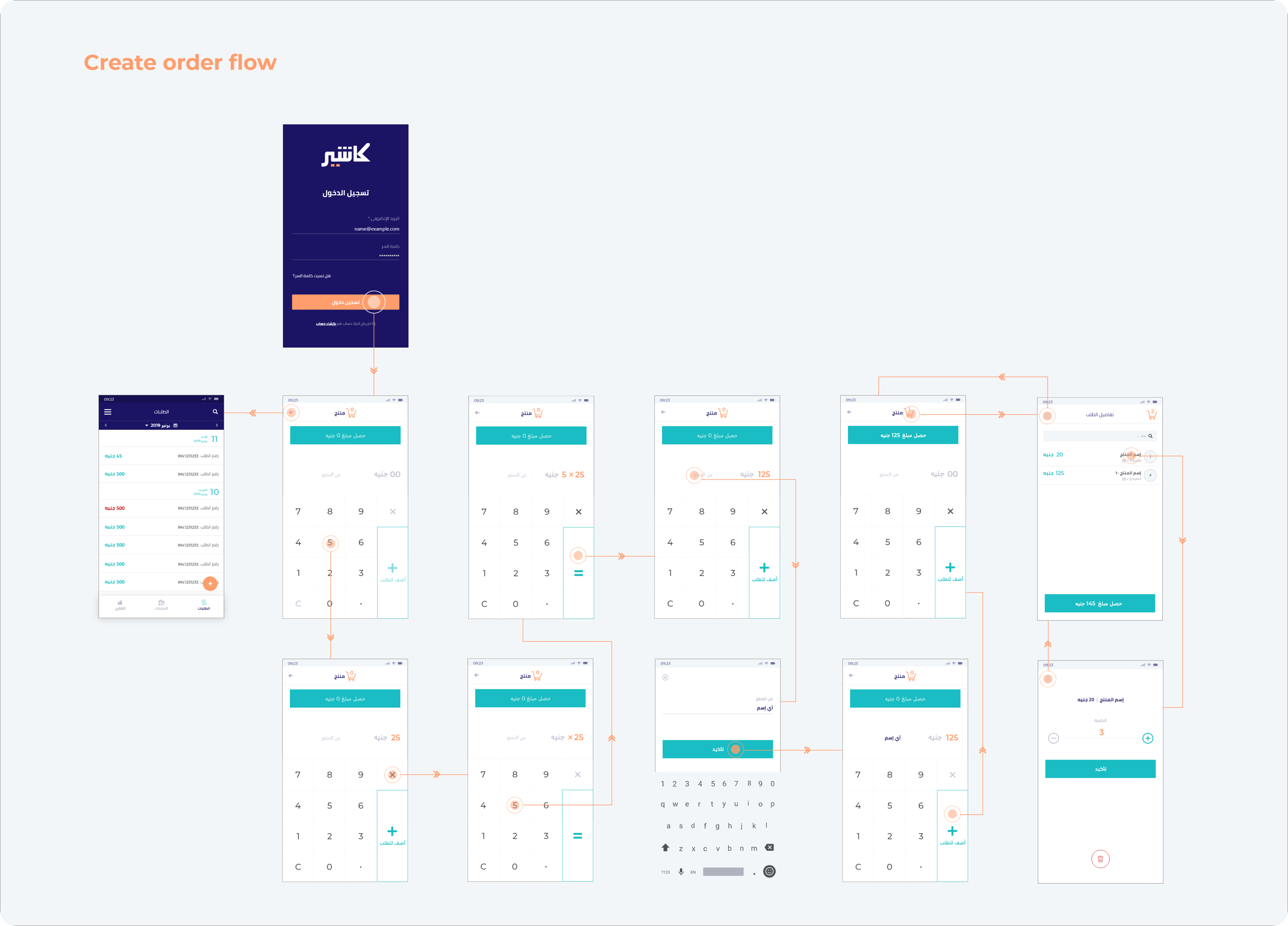
2- Create order flow
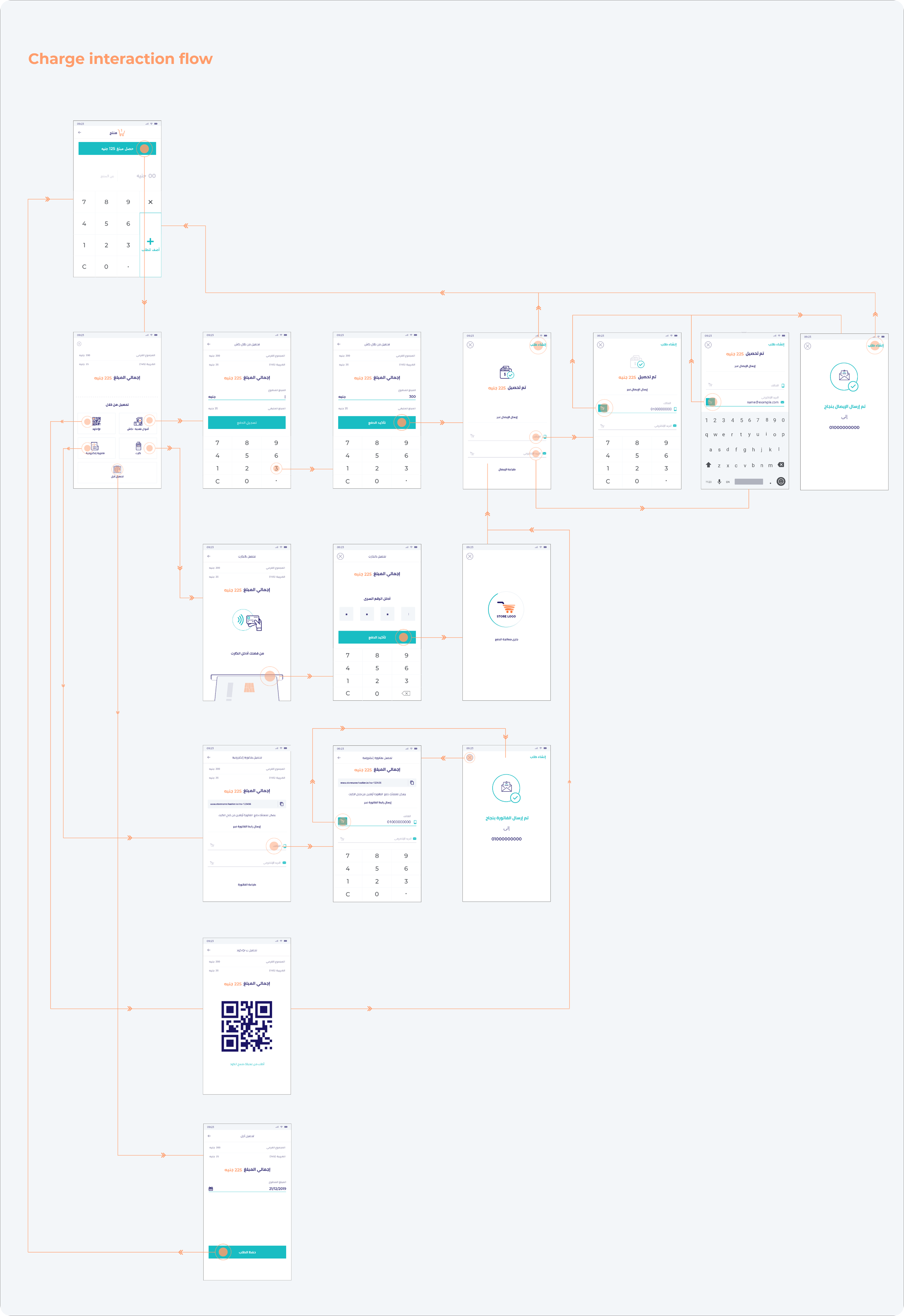
3- charge interaction flow
Prototyping & Testing
Goals
- Simplify multi-payment flow.
- Reduce cognitive load for merchants under time pressure.
- Improve visibility of total and confirmation states.
Testing Rounds: 4
Total Participants: 17
Devices Used: Android phones, iPads, and POS terminals
📱 Tablet User Experience
Overview
To expand Kashier’s usability, we extended the POS experience to tablet devices, focusing on shared environments like checkout counters where multiple users interact simultaneously.
The goal was to deliver a collaborative, high-visibility interface without losing the simplicity of the mobile flow.
Challenges
- Scaling mobile layouts led to poor use of screen space.
- Tablet mode required multi-user role switching (cashier, manager, customer).
- The design needed to support both orientations for mounted setups.
- High-volume stores demanded faster tap-to-complete transactions.
Design Approach
We built high-fidelity interactive prototypes to explore adaptive and split-screen interactions.
Key Enhancements:
- Dual-Pane Layout: Orders on the left, payments on the right — reducing navigation loops.
- Persistent Action Bar: “Confirm Payment,” “Send Receipt,” and “Start New Order” remained visible.
- Adaptive Grid System: Modular scaling ensured consistency between screen sizes.
- Touch-Optimized Zones: Larger hit areas minimized mis-taps in crowded environments.
- Visual Hierarchy: Bold color-coded states improved recognition speed.
Prototype
“The tablet version feels like a real register — everything I need is visible and easy to reach.”
— Merchant Test Participant
Key Insights
- Landscape orientation was preferred by 90% of testers.
- The split-view allowed simultaneous order tracking and payment confirmation.
- Merchants valued real-time visual feedback (receipts, totals, confirmations).
- The prototype helped define tablet-specific interaction standards for future Kashier products.
Outcome
The tablet redesign elevated Kashier’s product from a mobile-first app to a cross-platform POS ecosystem.
It empowered merchants with faster transactions, improved collaboration, and scalable UX consistency across devices.
This positioned Kashier as one of the few fintech players offering multi-device POS experiences optimized for real-world retail conditions.
📈 Impact

Business Impact:
✔ Improved merchant onboarding and trust.
✔ Unified design system across devices.
✔ Established a scalable UX research process for future Kashier updates.
💬 Final Reflection
The Kashier POS redesign proved that great fintech experiences come from empathy, not complexity.
By combining data-backed UX research with rapid prototyping and user testing, we delivered a high-performing, multi-device POS experience that supports both solo entrepreneurs and enterprise retail teams.
“Design isn’t just about simplifying; it’s about empowering people to act with confidence.”