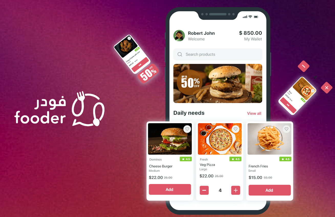
Case Study — User Journey Optimization for Fooder: Reducing Drop-offs & Boosting Orders
User Journey Optimization for Fooder – Reducing Drop-offs & Boosting Orders
TL;TR
The Fooder app faced usability challenges during its ordering flow, leading to user frustration and drop-offs before checkout.
While users loved the convenience of ordering food online, multiple friction points — like early login requirements, confusing customization, and redundant checkout steps — negatively impacted their experience.
Through a comprehensive user journey mapping exercise, we analyzed each stage of the process — from discovery to order confirmation — and identified the exact pain points affecting user emotions and decisions.
By rethinking these key touchpoints, simplifying flows, and introducing clearer navigation, we aimed to transform the user experience from confusing and frustrating to seamless and satisfying.
My Role
As a UX Designer, my role was to:
- Map the end-to-end customer journey for the Fooder mobile app.
- Identify friction points and emotional pain triggers across phases.
- Propose design improvements and data-backed opportunities to streamline the ordering experience.
I collaborated closely with product managers, developers, and growth marketers to translate user behavior insights into actionable design recommendations.
Goal
Our goal was to:
- Understand why users were dropping off before completing their food orders.
- Improve usability and clarity across the ordering process.
- Increase checkout completion and overall user satisfaction.
Process
We approached this project using a user-centered design process focused on empathy, mapping, and iteration.
1️⃣ Research & Discovery
We began by observing user sessions, analyzing support tickets, and gathering feedback from customers who ordered via WhatsApp links or the Fooder app.
We found patterns of confusion and frustration in multiple stages of the journey.
2️⃣ Journey Mapping
We visualized the full journey from Discover → Order Placement, noting:
- User actions at each phase
- Touchpoints (app, WhatsApp links, checkout screens)
- Emotions and thoughts
- Pain points and opportunities for improvement
This journey map became our north star for identifying where friction occurred.
User Journey Analysis
Phase 1 — Discover
Actions: Clicking shared links from WhatsApp or social media.
Pain Point: Users didn’t know where links led — unclear whether they’d see a menu, landing page, or promo.
Emotion: 🤔 Curious but uncertain
Opportunity: Clarify entry points — add visual hints like “View Menu” or “Start Your Order”.
Phase 2 — Initial Product Selection
Actions: Browsing menu and images.
Emotion: 🙂 Excited and engaged
Pain Point: Users struggled to find specific dishes or categories.
Opportunity: Enhance navigation and add “recommended/popular” sections for quicker choices.
Phase 3 — Order Type Selection
Actions: Forced to select “Dine-in”, “Takeaway”, or “Delivery” before browsing.
Emotion: 😕 Confused and interrupted
Pain Point: Premature decision-making before exploring the menu.
Opportunity: Allow browsing before committing to order type; auto-detect preferences later.
Phase 4 — Address Input for Delivery
Actions: Required login before entering delivery details.
Emotion: 😞 Disappointed and frustrated
Pain Point: Log-in barrier disrupts flow; users drop off here.
Opportunity:
- Delay login until payment step.
- Enable map-based address selection.
- Offer guest checkout or one-tap verification.
Phase 5 — Product Details & Customization
Actions: Selecting add-ons, portion sizes, or toppings.
Emotion: 🙂 Thinking but slightly uncertain
Pain Point: Complex customization UI and unclear pricing.
Opportunity: Simplify customization layout and show dynamic total pricing in real-time.
Phase 6 — Viewing & Managing Basket
Actions: Reviewing basket before checkout.
Emotion: 😐 Bored and cautious
Pain Point: Subtotals unclear; changing order type empties basket.
Opportunity:
- Keep basket persistent even when order type changes.
- Add smart “Review Summary” before checkout.
Phase 7 — Checkout Process
Actions: Payment, coupon input, and address confirmation.
Emotion: 😠 Angry and impatient
Pain Point: Too many redundant steps; form duplication and unclear success feedback.
Opportunity:
- Streamline to a one-page checkout.
- Combine address + payment.
- Add instant validation and success confirmation.
Phase 8 — Order Placement
Actions: Confirming order and viewing tracking.
Emotion: 😊 Relieved and satisfied
Pain Point: Users unsure about delivery timing or status post-payment.
Opportunity:
- Add real-time order tracking.
- Provide estimated delivery time and progress updates.
Insights & Learnings
- Reduce Cognitive Load: Too many early decisions (login, order type) overwhelm users.
- Enable Progressive Disclosure: Ask for details only when needed.
- Clarity Beats Complexity: Visual appeal matters less than usability in transactional flows.
- Retain User Context: Persist basket and preferences to minimize restarts.
- Feedback Loops Build Trust: Real-time confirmation and tracking close the emotional gap post-purchase.
Proposed Solutions
ProblemSolutionForced login early in flowIntroduce guest checkout or login at payment stepOrder type confusionAllow flexible switching without losing basket dataAddress entry frictionImplement map picker + auto-fill for saved locationsCustomization confusionSimplify UI with real-time price updatesCheckout fatigueMerge steps into one cohesive flowTracking uncertaintyAdd live order tracker and ETA feedback screen
Key Takeaways
- A smooth ordering journey is built on momentum — every interruption risks abandonment.
- Emotion mapping revealed where users felt confused or impatient — data that directly informed design priorities.
- Small interaction changes (like persistent basket, flexible order type, or simplified login) can significantly enhance satisfaction.
Outcome (Next Steps)
Our insights led to a plan to redesign the ordering flow with a focus on:
- Streamlined login and address handling
- Dynamic basket and customization logic
- Simplified checkout experience
Future iterations will focus on A/B testing redesigned flows to validate improvements in:
- Checkout completion rate
- Average session time
- Overall user satisfaction
💬 Final Reflection
This project reinforced a core UX principle:
“Convenience isn’t just speed — it’s clarity.”
Designing a food ordering experience means removing obstacles that distract users from their goal: getting their meal quickly and confidently.